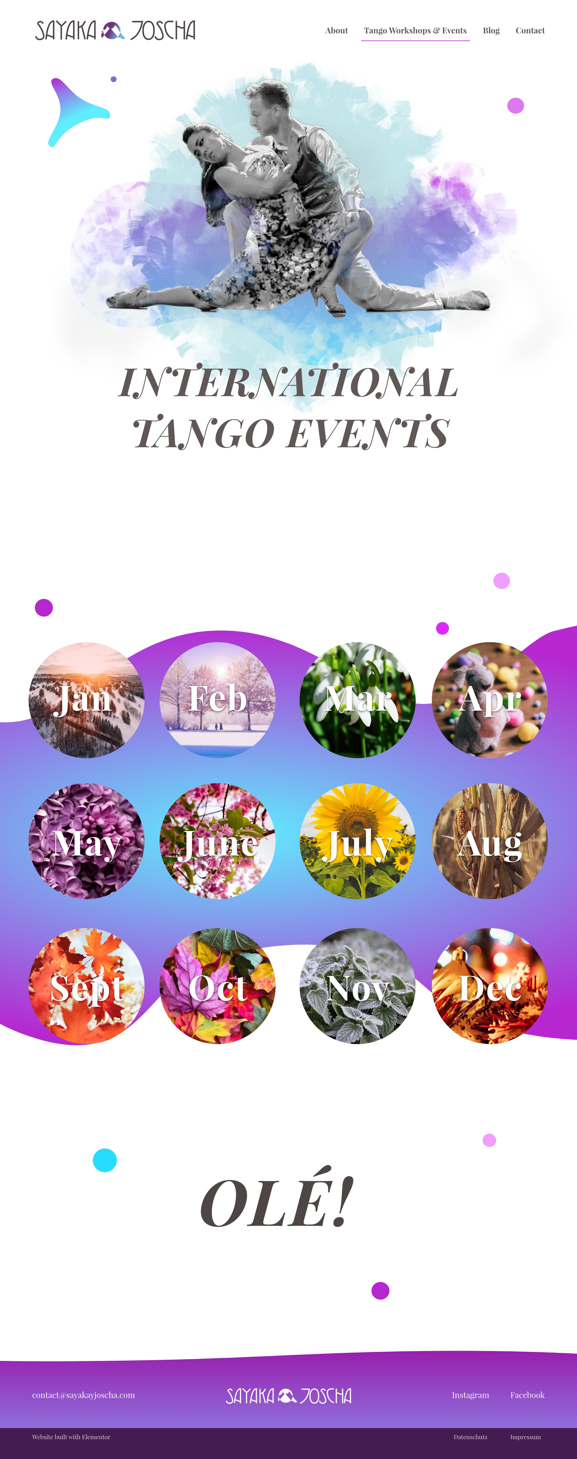
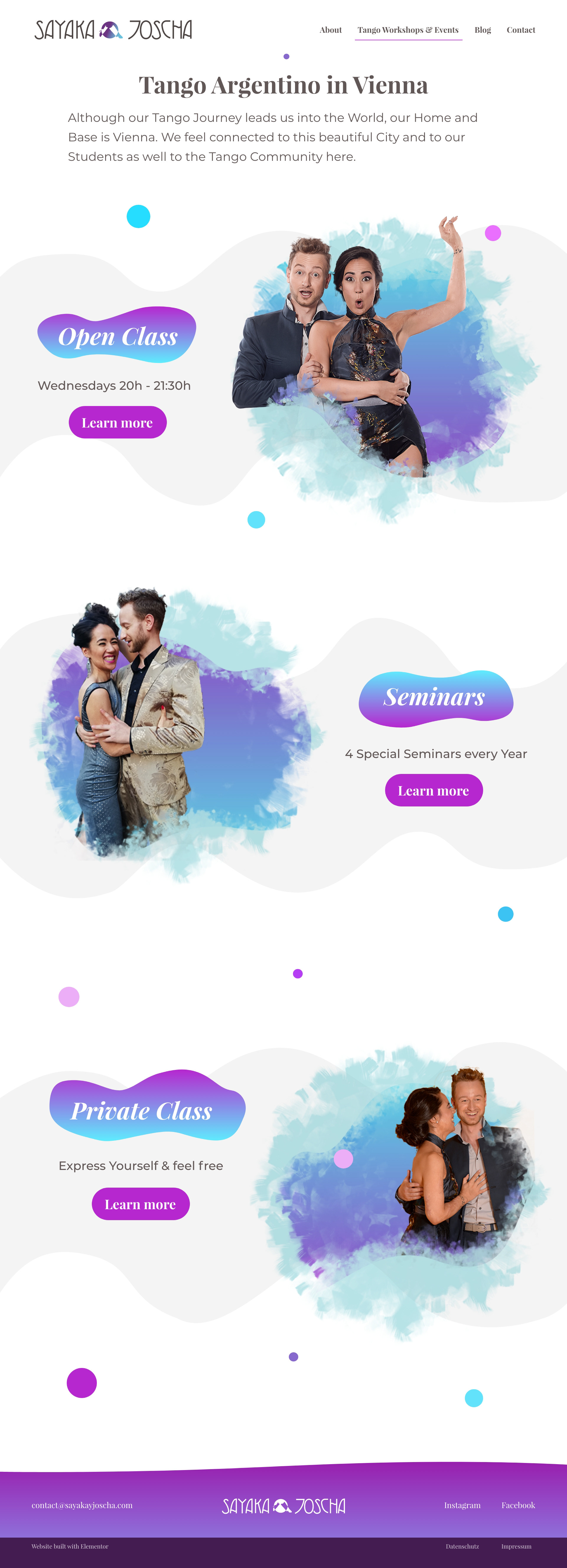
full Landing Page incl. Onlineshop
The goal with this website was to portray Sayaka & Joscha as professional tango dancers and teachers. Before, their website was more like a do it by your self approach and they wanted to step up from it. Of course connected with more porfessionalism, they wanted to sell more tickets & classes but also collect email addresses to have a bigger reach.
Sayaka & Joscha are all about movement why i've chosen a video background in the hero section where the website shines and makes the first big impression.
Sayaka & Joscha are all about movement why i've chosen a video background in the hero section where the website shines and makes the first big impression.
Styleguide
I like to create a styleguide in the beginning phase when i plan a website because this ensures consistency throughout the design. Why is that important? It gives the user a great user experience where he/she can navigate easily through the entire website because it is easy to understand where to find what. In this case i went with 2 different main colors which underlines the masculine and feminine aspects.
Popups
Popups are a great way to give your website more fun when done right. You click on a button or scroll down the landing page to around 85% and this little graphic pops up. It can be contact information like on the left or an email newsletter popup with a function.


Shape & Graphics Explorations
Subpages
Usually i plan out the whole website first to ensure a cohesive design & function. Each page is discussed individually with the client to adapt the wishes & needs nicely.

